Telescope v2 Redesign
Today we are finally starting to roll-out our new design which we’ve been working on for the past couple weeks. The new design is the first step towards Telescope V2, which will bring a ton of new features and improvements to the platform (we’ll share some news about that soon, so stay tuned!).
With the new design, we wanted to address a few existing UX issues as well as prepare the platform for what’s coming in V2. Let me share a bit more details about what has changed and why.
New UI Look & Feel
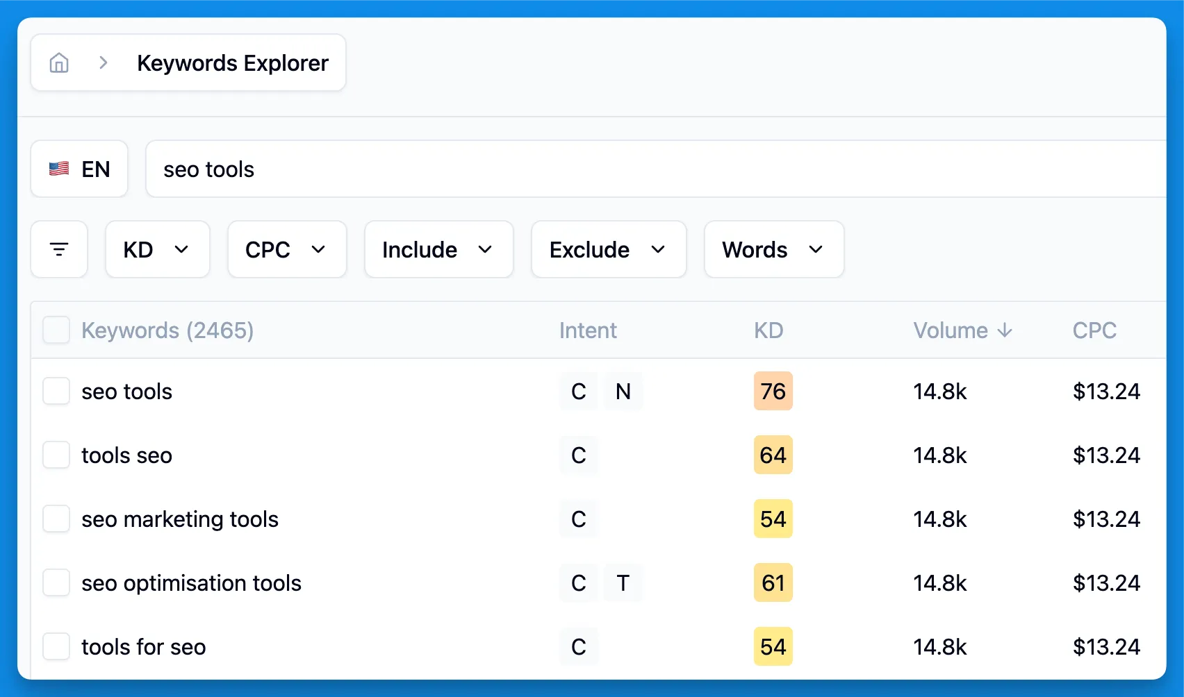
First thing you will notice once you login is our new UI language. We’ve updated the color scheme, migrated to the unified color pallet, tweaked typography and spacings in order to provide consistent experiences across all surfaces of the app. We worked more on the contrast and hierarchy to make sure that the most important information is always in focus.
As a small peak into the new design, here’s how our keyword explorer page looks like now.

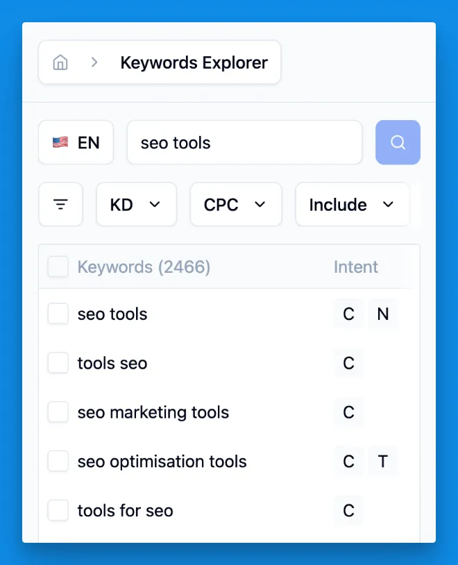
As a bonus, our new design is mobile-first, which means that now you’re able to use Telescope from your phone without any issues.

Organizations & Projects
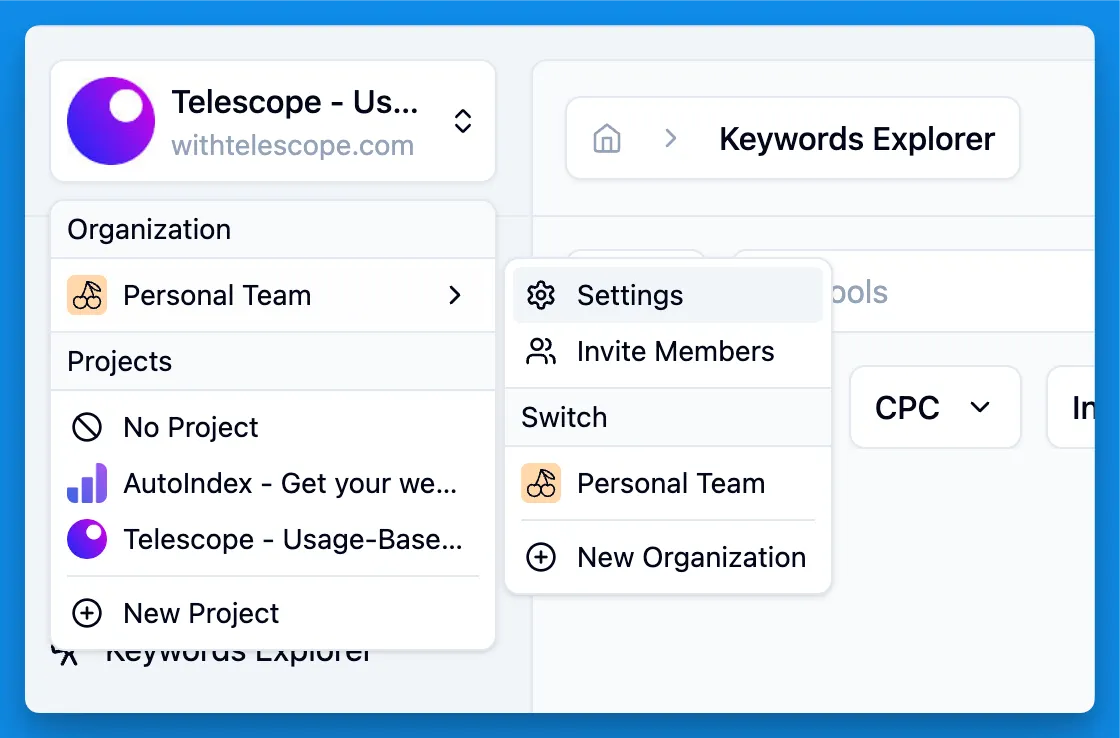
Historically, Telescope didn’t have any notion of a team, website or project. We always simply provided an interface to interact with our API. But in order to support more complex use-cases coming up in V2, we’re introducing the concept of Projects and Organizations.

These are pretty common concepts in the industry, but let me explain how we see them in Telescope:
- Organization is a top-level entity which represents a company or a team. You can invite members to your organization, assign roles and manage billing within an organization. By default, each new user is assigned to a personal organization. We’re also migrating all existing account to a personal organization.
- Project is a website or (once we roll-out mobile ASO support) an app that you’re working on. All the existing and future functionality will be scoped to a project. E.g. your keywords lists, competitors, SEO monitoring results, content plans, etc. You can have multiple projects within an organization. Every organization has a default project, which you can use for any ad-hoc research or testing.
As mentioned before, the main motivation for this change is to prepare the platform for the upcoming features, such as SEO Monitoring. You will have a separate section in the project, where you will see all the monitoring data, notifications, alerts and so on.
New Project Dashboard
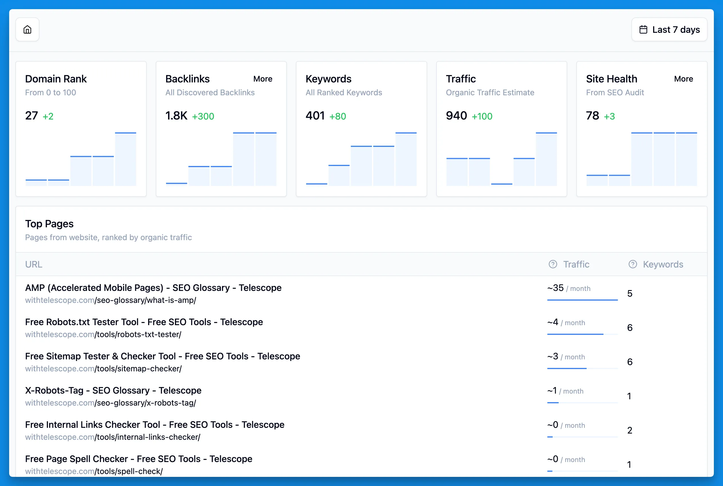
We’re launching the new Dashboard - a home for the most important information about your project, which auto-updates regularly and provides you with relevant up-to-date information at a glance, allowing you to dig deeper whenever you need.

Dashboard gives you an overview of all the important metrics for your project, such as domain rank, number of backlinks and keywords, top pages sorted by traffic, and more. Many new blocks are coming to the dashboard with the launch of new features.
Note that the dashboard refresh interval is based on the project settings and plan. All free users, by default, get a weekly dashboard data refresh for free.
What’s Next?
As I mentioned at the beginning of the article, this release is a first step towards our new version, which we call Telescope V2. In the upcoming weeks and months, we’re going to be enabling all the new features that will bring our vision of making Telescope a full-cycle SEO platform to life. Stay tuned for that!
Got any questions or feedback? Let us know via [email protected]!